
“Dialog of 9 Artists,” intermediate examination project by Sun Young Oh (© Sun Young Oh, HfG Karlsruhe)
“Dialog of 9 Artists,” intermediate examination project by Sun Young Oh (© Sun Young Oh, HfG Karlsruhe)
“Dialog of 9 Artists,” intermediate examination project by Sun Young Oh (© Sun Young Oh, HfG Karlsruhe)
“Dialog of 9 Artists,” intermediate examination project by Sun Young Oh (© Sun Young Oh, HfG Karlsruhe)
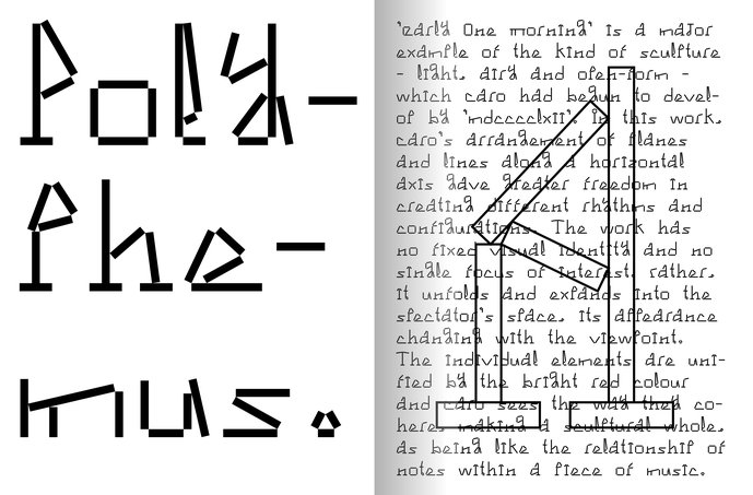
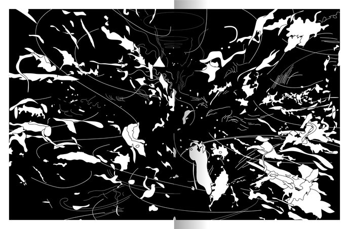
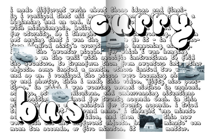
With this project, a connection has been made between typography and art. Nine typographical variations are created by addressing the concepts of nine different artists (Anthony Caro, Bernard Frize, Erwin Wurm, Henri Matisse, Julie Mehretu, Marcel Duchamp, Rachel Whiteread, Robert Mangold, and Uta Barth). Nine fonts with quite different concepts and forms, as different as the aesthetics and styles of nine artists, come together and are combined and mixed within the framework of the project.
A publication and posters were designed using these nine fonts. Through the publication and the specimen poster, the fonts do not remain isolated but breathe together and live like a group exhibition.
Typography is not simply a font, but can have a meaning, can become a tool for others to write texts with. In its abstract form, it limits itself to a minimum number of rules. As long as one can recognize the forms of the letters, there is enormous potential and many different options for dealing with the rules.
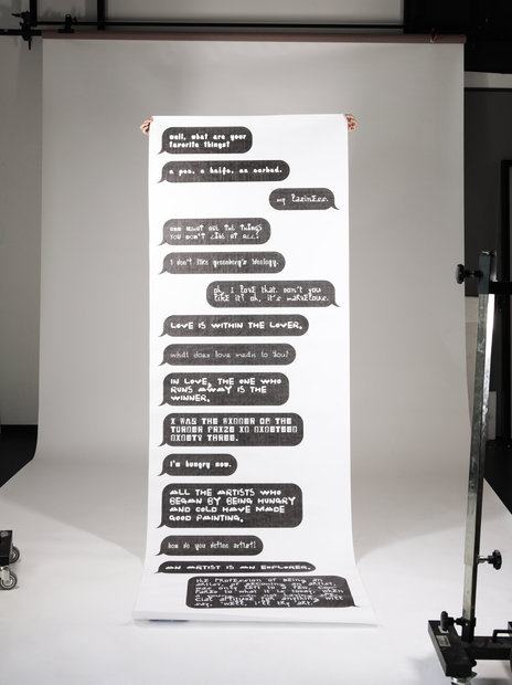
The publication is an archive and is designed like a newspaper. Each artist is assigned a whole sheet, and each sheet consists of a one-page poster side and a two-page book side. The sequence of the pages is variable, and the fonts can be combined in different ways.
For the specimen posters, a fictitious chat between the nine artists was prepared. For this, interviews with the nine artists were collected and merged into a dialog by means of a keyword search.
More Projects
-
-

-
-
Communication Design
-
Sun of an Ignored. Putrid Productivity – Intermediate examination project by Bárbara Acevedo Strange and Eva Tatjana Stürmer
-
-
-
-
-
-
Communication Design
-
Zeitmaschine (Time Machine) – Final project by Marco Sanna
-
-
-
-
-
-
Communication Design
-
formfunk. Kommunikationsdesign Podcast – Final project by Matthias Gieselmann
-
-
-
-
-
-
Communication Design
-
Notizen, und selbst wenn ich nicht gut ziele und den Falschen erwische, es wird heilsam sein – Intermediate examination project by Phil Zumbruch
-
-
-
-
-
-
Communication Design
-
KubaParis – Final project by Saskia Hohengarten
-
-
-
-
-
-
Communication Design
-
Describe This – Intermediate examination project by Simon Knebl
-
-
